Nature Aerocraft

For confidentiality reasons, the real client cannot show either its name or concept; during job interviews or in confidential contexts, the actual material can be shown and explained. The real client does not stand behind any of the technical solutions or explanations shown below.

Role: Visual identity (solo)
Deliverables: Brand system, logo, image-filters

Nature Aerocraft is a family-owned business specializing in aerospace engineering and composite materials.

In the near future the company intends to adjust its business model, effectively transitioning from being a subcontractor in the field of aviation to focusing on an in-house airplane project full time. The new identity needed to signal this shift.

The Brief

Reposition the brand and communicate its focus on wide visibility, comfort, and engineering precision.

21_text

The superellipse sits at the core of the aircraft’s engineering and design logic. Applying a consistent scale of the shape across typography, layouts, symbols, and patterns ensures visual coherence.

The Solution

By translating engineering principles into a modular visual system, the identity bridges design and engineering. Gradients, grids, and calibration marks emphasize visibility and precision, while remaining flexible across applications.

The system allows Nature Aerocraft to present itself as both innovative and trustworthy, supporting its transition into aircraft manufacturing.

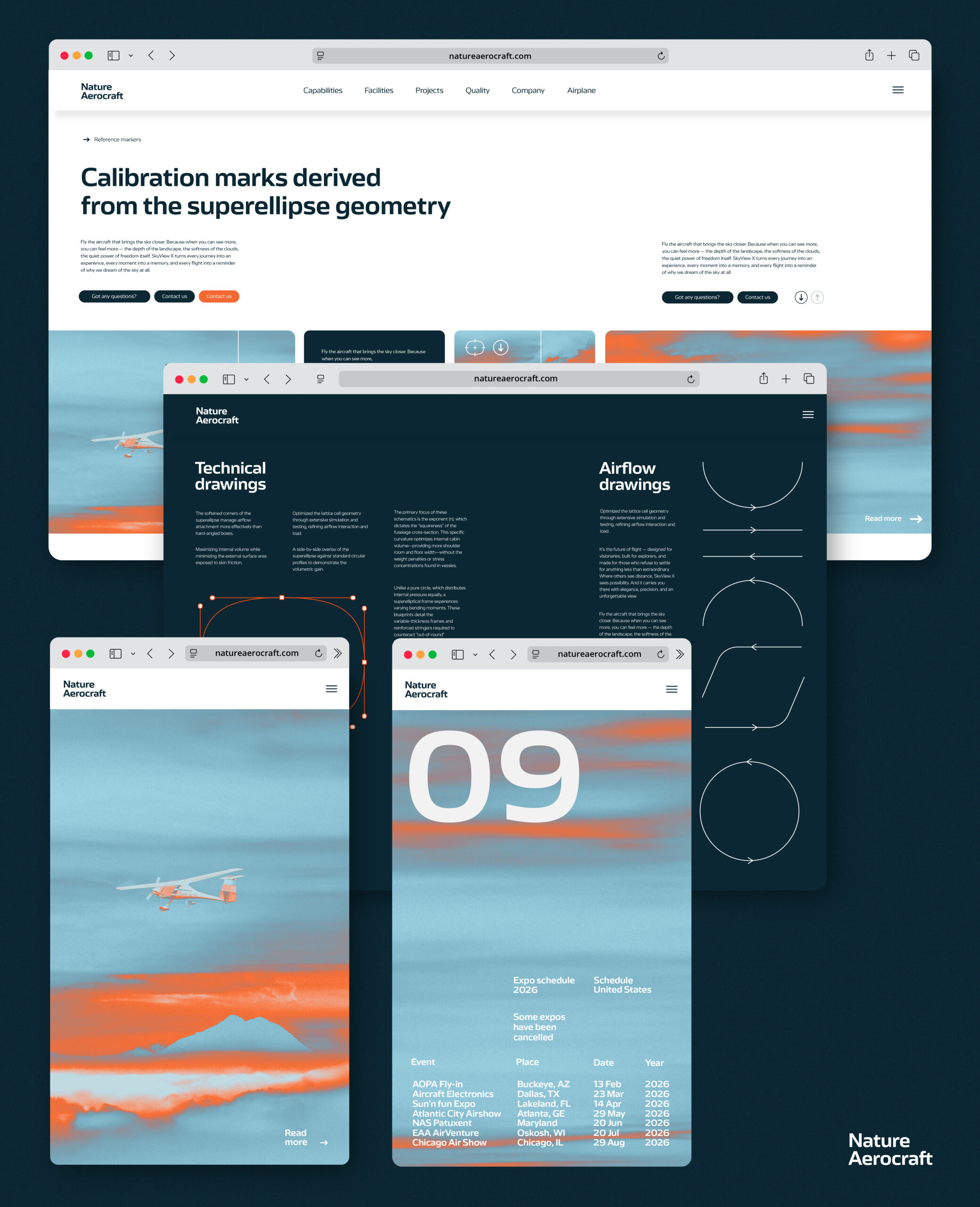
Custom calibration marks translate engineering precision into an intuitive language. Built from the core geometry, they support both functional clarity and visual consistency.