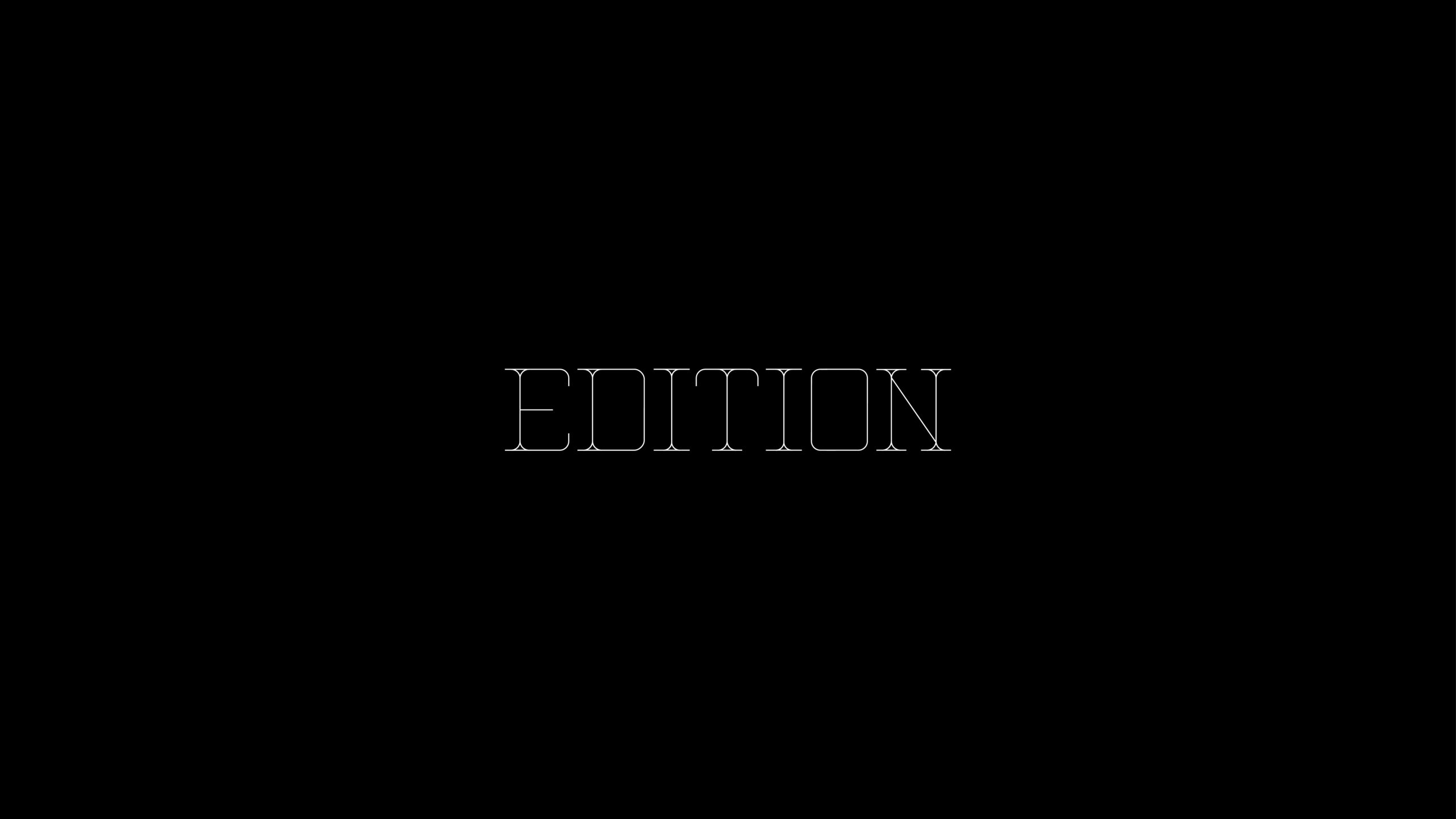
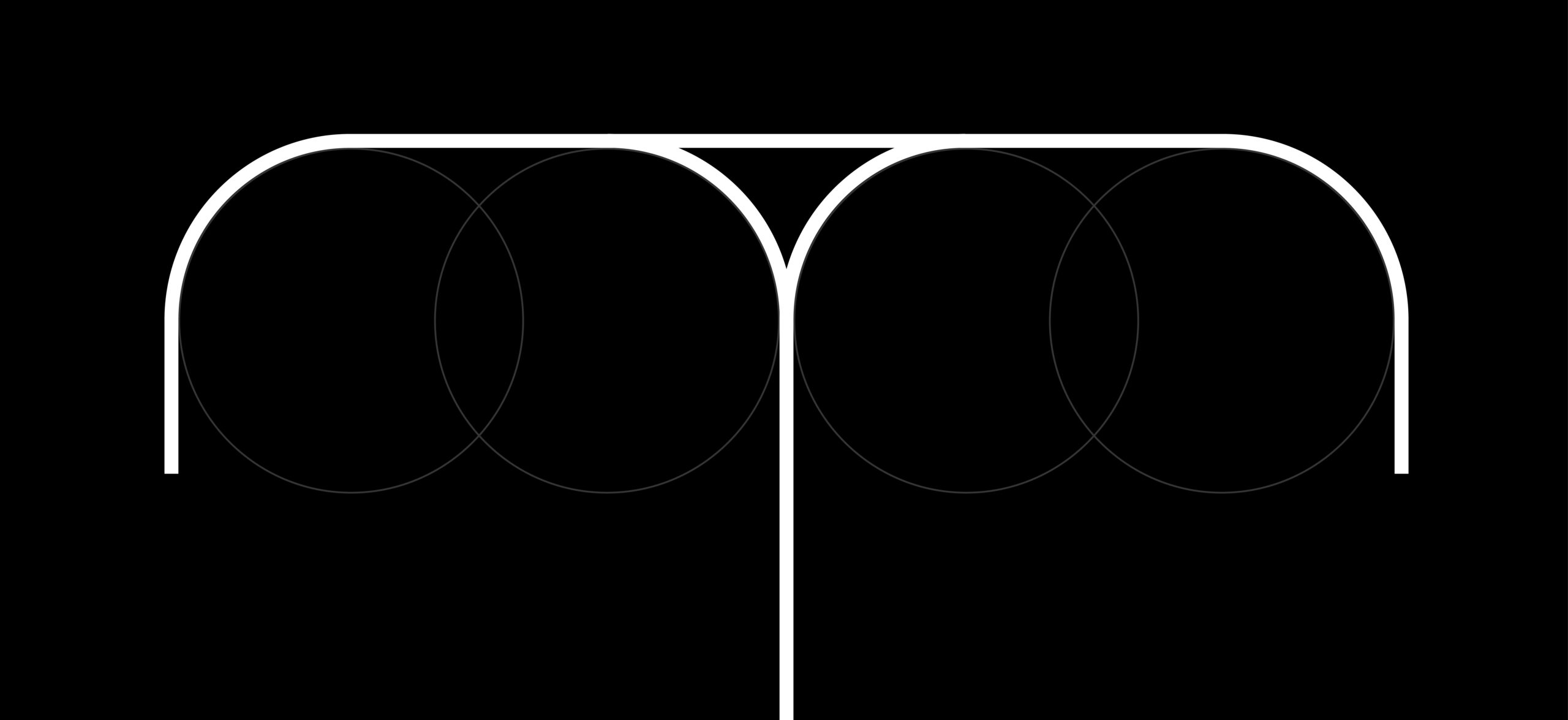
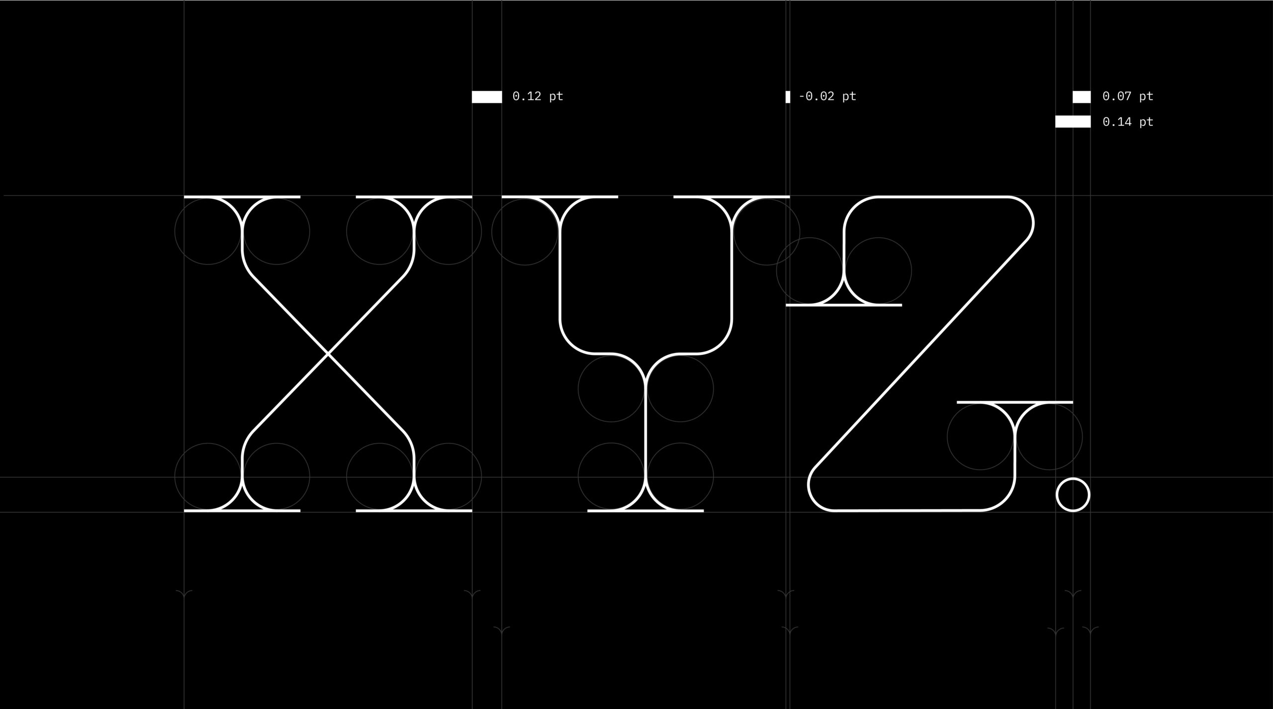
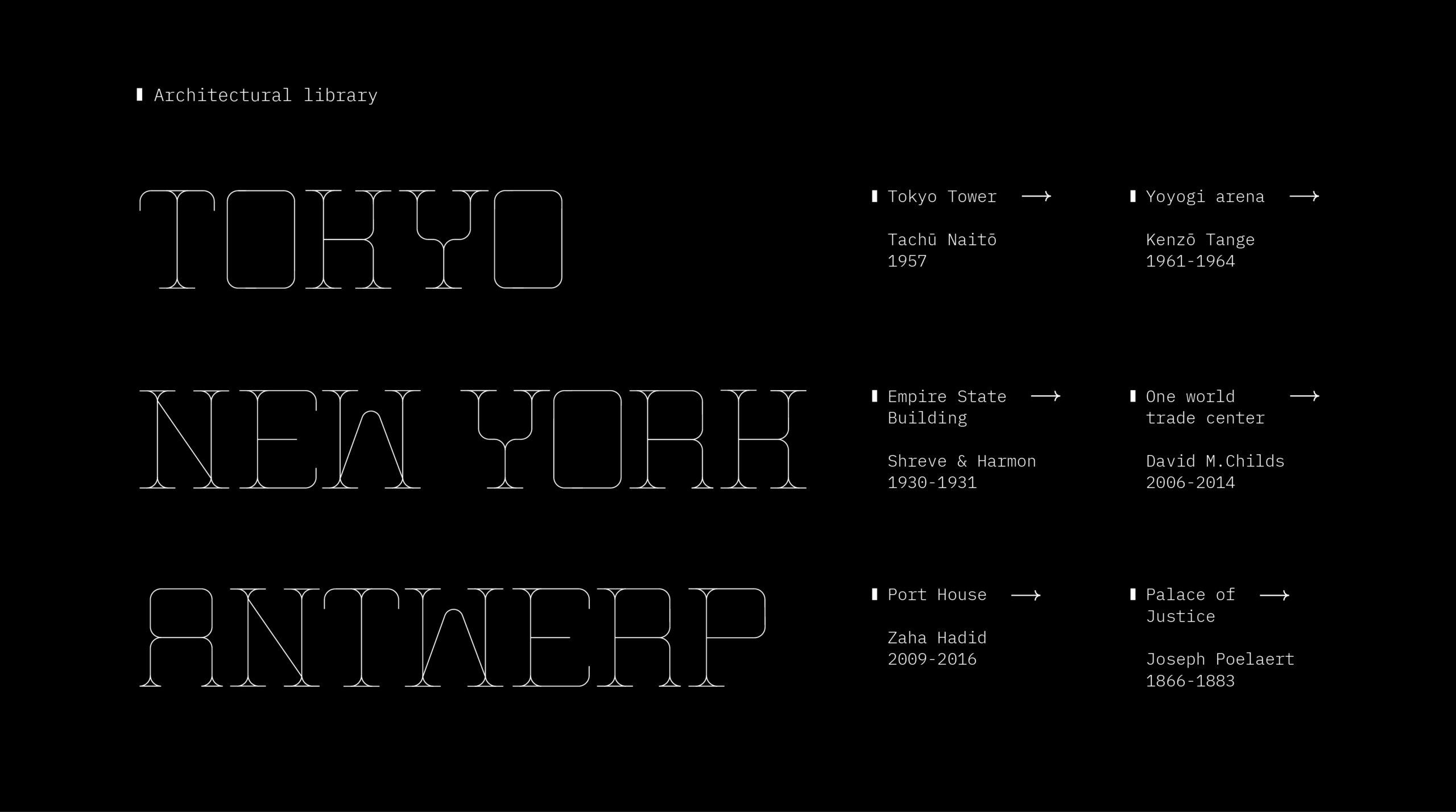
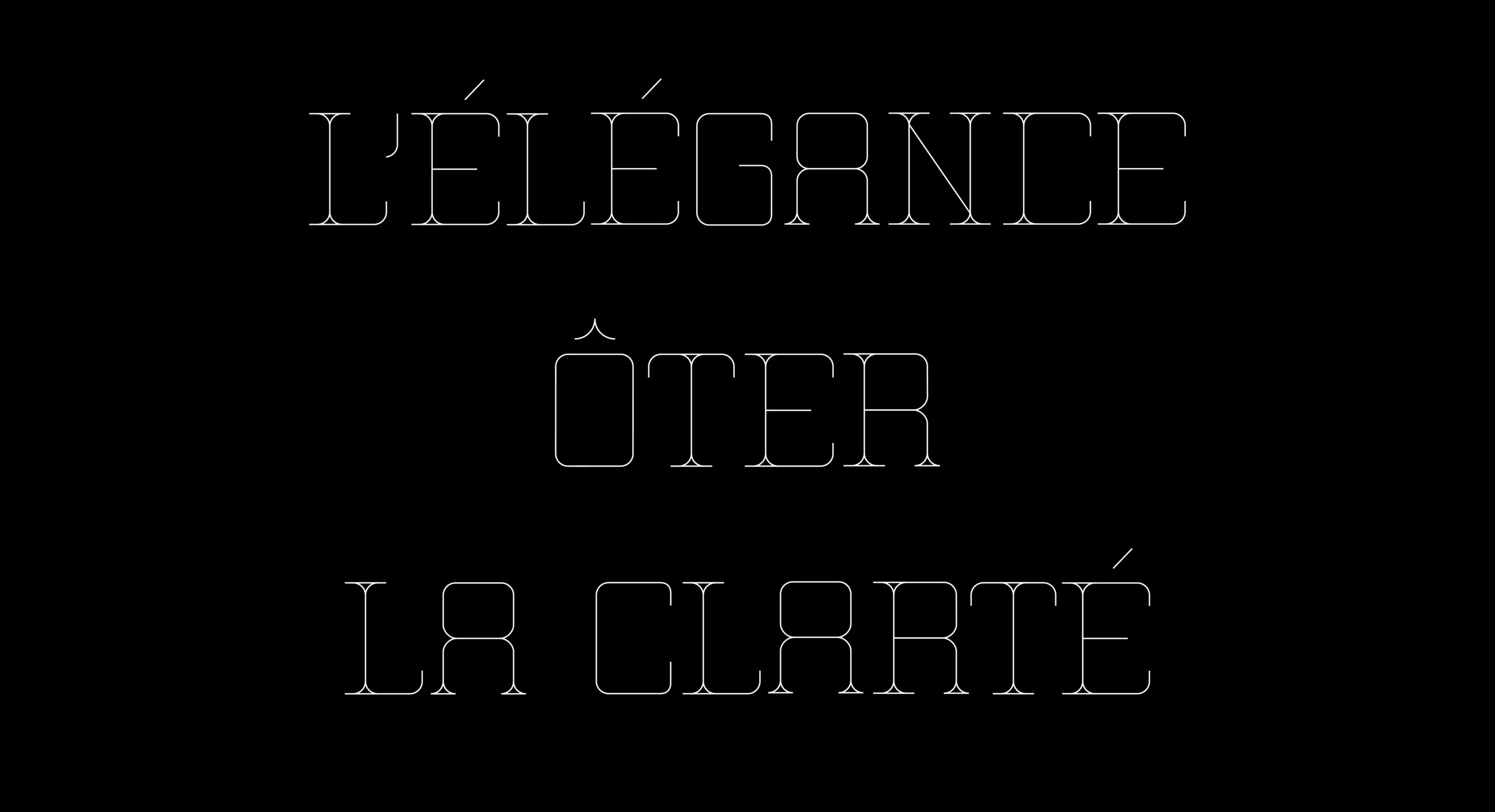
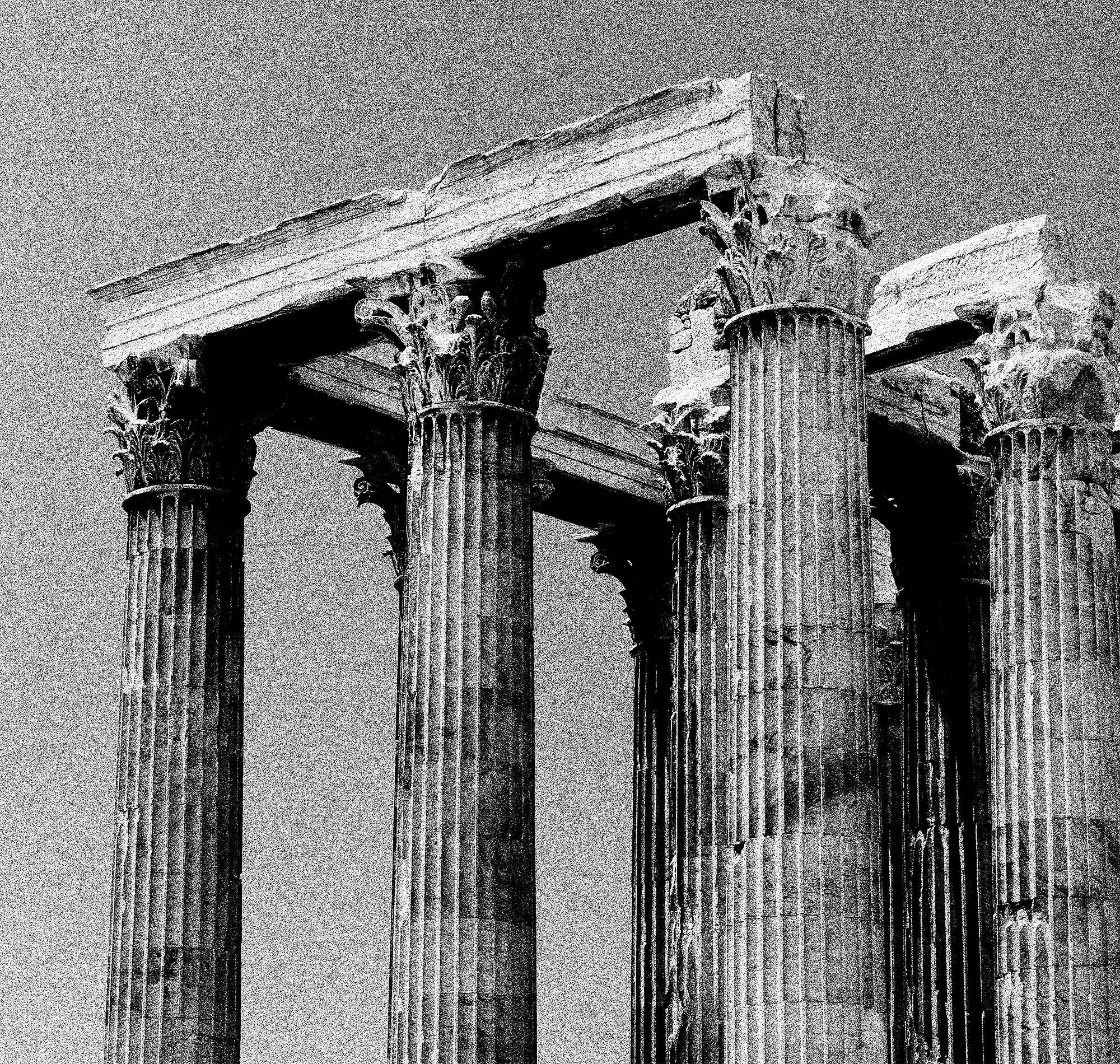
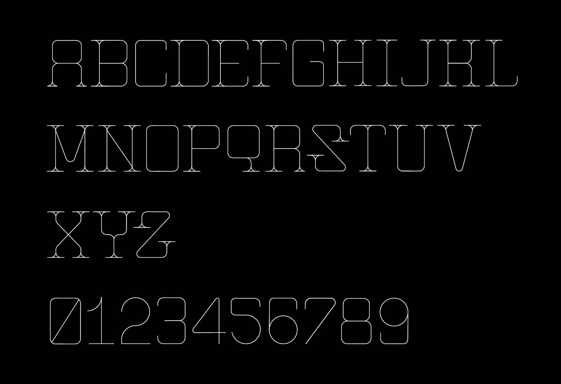
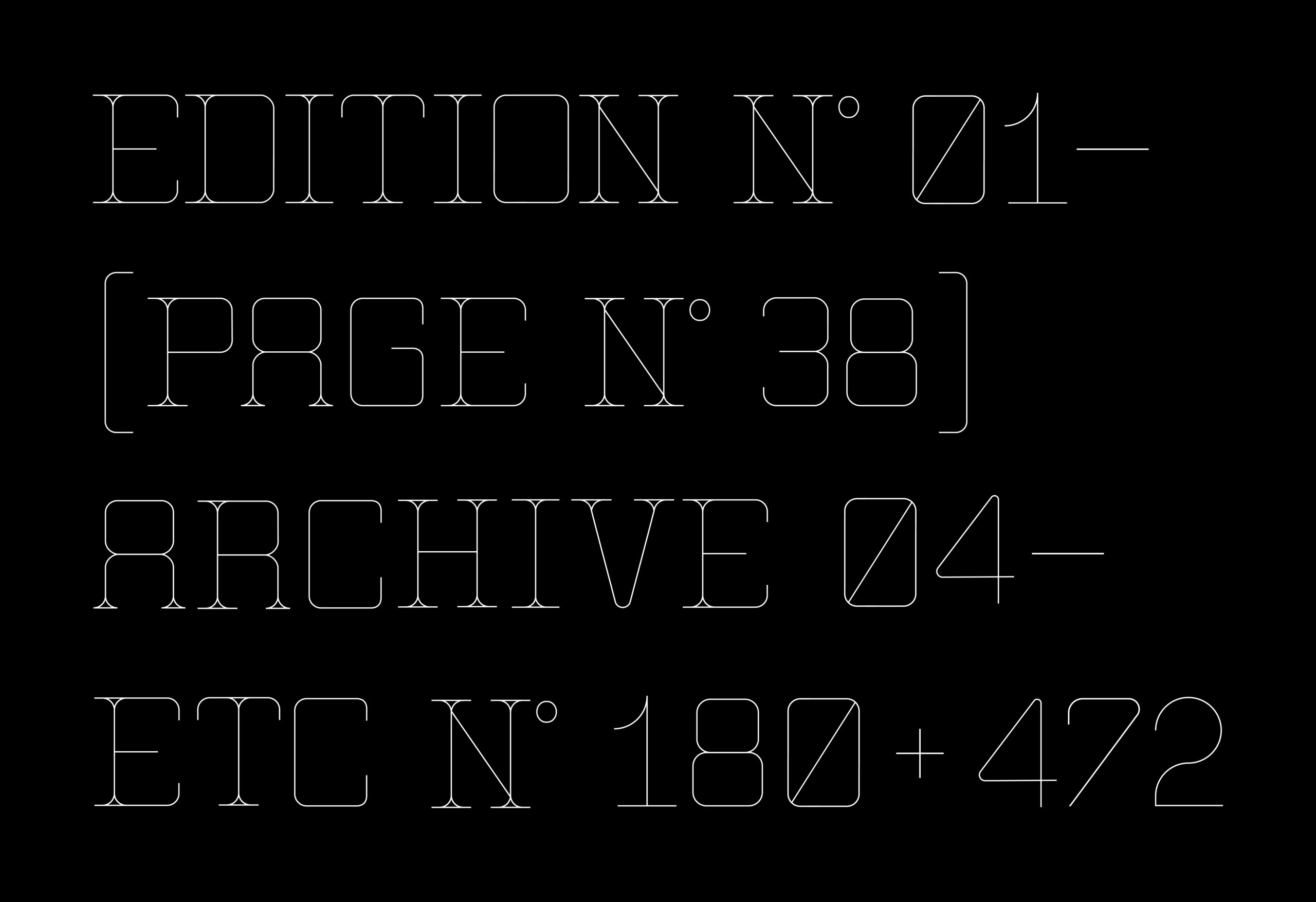
While walking the streets of Rome and Athens I was inspired by the columns and pillar-like surfaces. The letterforms combine rigid verticals with softened geometric terminals. Designed for large-scale use, Edition emphasizes rhythm, spacing, and silhouette over conventional readability, positioning it for architectural, cultural, and luxury contexts. I had to answer my own question, how do I make te typeface feel modern while referencing something ancient?